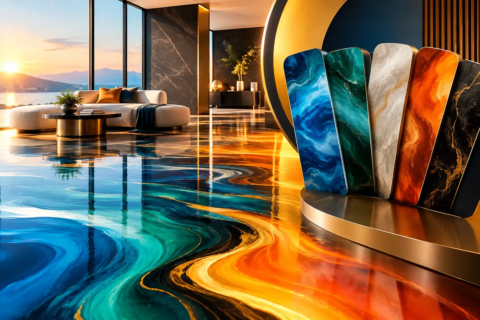
A floor color can make a beautiful room feel composed or make a high-end renovation feel slightly off. Knowing how to choose epoxy colors starts with treating the floor as a design element, not an afterthought. The right epoxy finish should support the architecture, reflect the character of the space, and hold its visual appeal long after installation day.
For a garage, showroom, patio enclosure, retail space, or open-concept home, epoxy gives you far more creative range than a standard gray coating. But more options also mean more decisions. Color, movement, sheen, flakes, and surrounding light all work together to create the final result.
Start With the Feeling You Want the Space to Create
Before comparing swatches, define the atmosphere. A luxury floor does not need to be loud to make an impression. In many spaces, the most elegant choice is the one that gives everything else in the room room to breathe.
For a calm, architectural look, consider soft grays, warm taupes, sand, cream, charcoal, or layered stone-inspired tones. These colors work especially well in contemporary homes, upscale garages, professional offices, and hospitality environments where the goal is refined versatility.
If the floor is meant to be the statement piece, metallic epoxy opens a different design direction. Deep charcoal with silver veining can feel tailored and dramatic. Pearl white, champagne, and soft bronze create a luminous, gallery-like effect. Navy, emerald, copper, and black can deliver a bolder custom finish when balanced with the right walls, furnishings, and lighting.
The question is not simply, “What color do I like?” Ask what the room should communicate. Clean and modern? Warm and inviting? High-energy and branded? The answer will narrow the field quickly.
Consider the Existing Design, Not Just the Concrete
An epoxy floor is visually substantial. It covers a large surface area, which means it should complement permanent elements that are expensive or impractical to change later. Look closely at cabinetry, countertops, brick, stone, wall color, trim, ceiling details, fixtures, and doors.
Warm materials generally pair best with warm-toned epoxy. Wood cabinetry, tan brick, travertine, and brass accents often sit beautifully beside caramel, greige, bronze, cream, or warm gray finishes. Cooler environments with stainless steel, blue-gray stone, black metal, or bright white walls can support slate, silver, charcoal, graphite, or blue-based tones.
Neutral does not always mean plain. A layered flake system in several shades of gray, beige, black, and white can bring visual depth without competing with the rest of the space. This is one reason flake floors are a popular choice for garages and commercial areas: they look polished, conceal everyday dust well, and coordinate with a wide range of design styles.
For commercial properties, incorporate the brand environment as well. A floor does not need to match a logo exactly to feel connected to the business. A restrained neutral base with a subtle accent color often looks more timeless than a full floor in a bold corporate hue.
Evaluate Natural and Artificial Lighting
Lighting can change epoxy colors dramatically. A sample that reads as a soft gray in bright daylight may look blue or cool under LED fixtures. Metallic pigments can appear understated from one angle and richly dimensional from another.
Natural light is usually the first consideration. South- and west-facing rooms receive warmer, stronger light, which can make cream, tan, bronze, and gold tones feel especially inviting. North-facing spaces tend to receive cooler light, so an overly cool gray may feel stark unless that crisp, modern effect is intentional.
Artificial lighting deserves equal attention. Warm bulbs bring out amber, beige, brown, and copper notes. Cooler white lighting sharpens silvers, blacks, whites, and blue undertones. In retail, restaurant, and hospitality spaces, evening lighting may matter more than daytime lighting, so evaluate the finish under the conditions guests will actually experience.
This is particularly important with metallic epoxy. Its movement and shimmer are part of the design, but the amount of visible contrast depends on light direction, ceiling height, windows, and the level of gloss. A professional sample review in the actual space is more reliable than choosing from a phone screen or a small image.
Choose Epoxy Colors With Daily Use in Mind
A floor should suit the way the space lives and works. Light colors can make a smaller room feel open and elevate a clean, airy aesthetic, but pure white or very pale solid finishes may reveal tire marks, soil, and spills more readily in garages or active commercial settings.
Dark floors create contrast and can feel sophisticated, especially with light walls and modern fixtures. Yet a nearly black finish may show dust, pet hair, footprints, or light debris in sunlit rooms. In a low-traffic lounge, that may be a worthwhile trade-off. In a busy garage, service area, or retail entrance, a mid-tone blend is often the more practical luxury choice.
Consider these four performance-minded approaches when choosing a color direction:
- Mid-tone flake blends offer excellent visual texture and are forgiving with dust, dirt, and everyday traffic.
- Gray, greige, and taupe systems provide long-term versatility if décor or ownership may change over time.
- Metallic finishes create the strongest custom impact but benefit from a space where their movement can be appreciated.
- Darker solids can look exceptionally sleek when the environment is controlled and cleaning routines are consistent.
The best choice is not always the one that hides everything. It is the one whose maintenance needs feel reasonable for the property and its users.
Decide Whether the Floor Should Lead or Support the Room
A metallic epoxy floor can resemble natural stone, polished metal, flowing water, smoke, or abstract art. It is ideal when the floor should become part of the visual experience. In an entertainment room, luxury showroom, salon, lobby, or custom residence, that sense of one-of-a-kind movement can create a memorable finish that standard flooring cannot replicate.
However, strong movement is not right for every setting. If the room already includes bold countertops, patterned tile, dramatic wallpaper, or feature lighting, a quieter flake or solid-color system may create a more balanced result. Premium design is often about restraint. Let one or two elements carry the visual drama rather than asking every surface to compete.
For connected spaces, think about sightlines. A floor that looks dramatic in a small sample can feel much more prominent across a large open area. Conversely, a subtle finish may gain beautiful complexity once it spans the full room. Viewing larger sample boards and discussing the intended application method helps set realistic expectations.
Think Beyond Trends
Trends can be useful for inspiration, but floors are long-term surfaces. A color that feels exciting now should still make sense five or ten years from now. Warm neutrals, mineral grays, black-and-white blends, soft stone colors, and metallics inspired by natural materials tend to age gracefully because they connect to enduring interior design principles.
That does not mean avoiding personality. A bespoke epoxy floor should feel personal to the property. The key is to use bold color with purpose. Rich blue may be perfect for a coastal-inspired business, a sports room, or a branded commercial setting. Copper may complement a home with warm wood and industrial details. The right color is one that belongs to the space, rather than one selected only because it is trending online.
Review Samples at Full Scale Before Finalizing
Small chips and digital images are useful starting points, not final decisions. Epoxy has depth, variation, reflectivity, and texture that cannot be fully captured in a tiny sample. This is especially true for metallic systems, where application technique influences the finished pattern.
Ask to see samples beside the materials already in the room. Place them near walls, cabinetry, and doors. View them in morning light, afternoon light, and under evening fixtures. If possible, step back several feet. Floors are seen from a distance and across a broad field of view, so the overall composition matters more than a close-up alone.
A skilled decorative concrete team can also guide the conversation beyond color names. They can explain whether a desired finish suits the slab condition, room function, desired sheen, and maintenance expectations. At Superior Concrete Solutions, that consultation-led approach helps turn a color preference into a finish that feels considered from every angle.
Let the Floor Belong to the Property
The most successful epoxy color is not chosen in isolation. It reflects the light, complements the finishes, supports daily use, and gives the space a sense of intention. Whether that means a quiet, stone-inspired flake blend or a striking metallic composition, choose the finish that will make the property feel more complete every time you walk into it.